
The Left Rough

The goals and constraints
The Problem
The game of golf is hard. Why make it harder? Data supports the notion that using a smartphone during the round can lead to 'switch cost', which in turn causes negative side effects during play.
The Challenge
The Left Rough aims to solve one problem. Remove the distraction of your phone while keeping score on the course.
Constraints
The must haves:
- Modern visuals with a minimal style
- One primary action
- Camera Upload
Objective
Craft the brand and visual language, as well as design and prototype the flow to upload a scorecard using the camera.

My game's got 99 problems but my phone ain't one
A 2024 survey of 186 recreational golfers at five different courses around the US showed that smartphone use during the round negatively impacted their performance. From here the study concluded that this effect can be attributed to what is defined as ‘Switch Cost’.
Switch Cost describes the consequences of cognitive switching between shot routines and external concerns.
International Journal of Performance Analysis in Sport DB le Roux, L Carstens, C Walburgh, C Werth (2024)
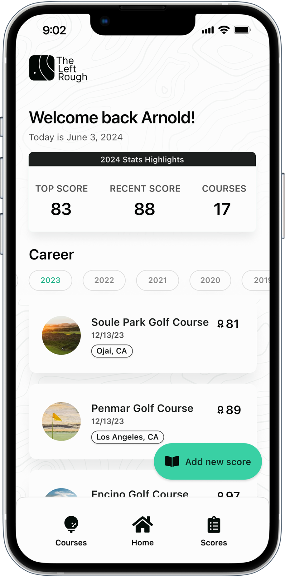
The Left Rough solves this problem with a mobile app designed for after-round use.

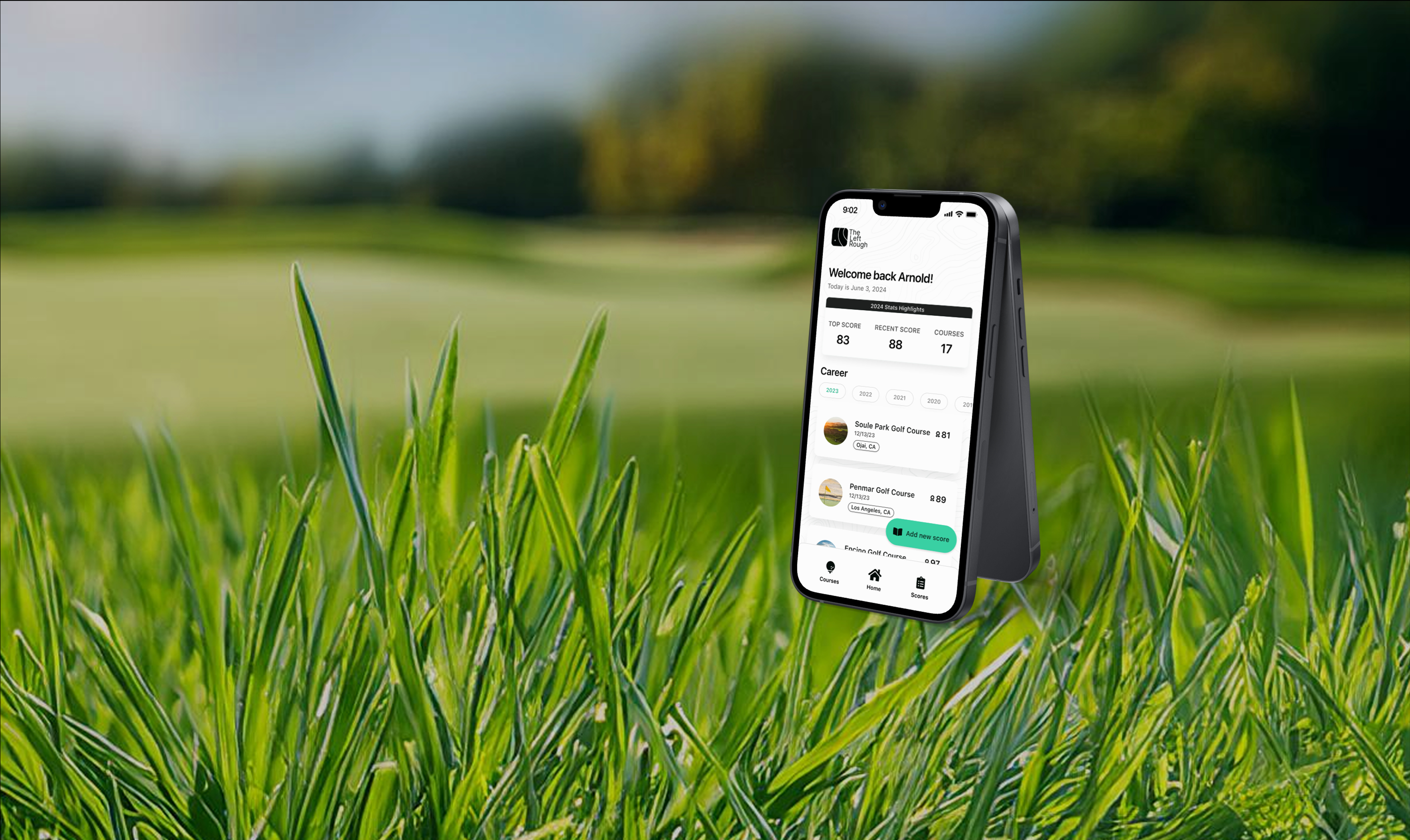
Never Lose Your Game Face Again
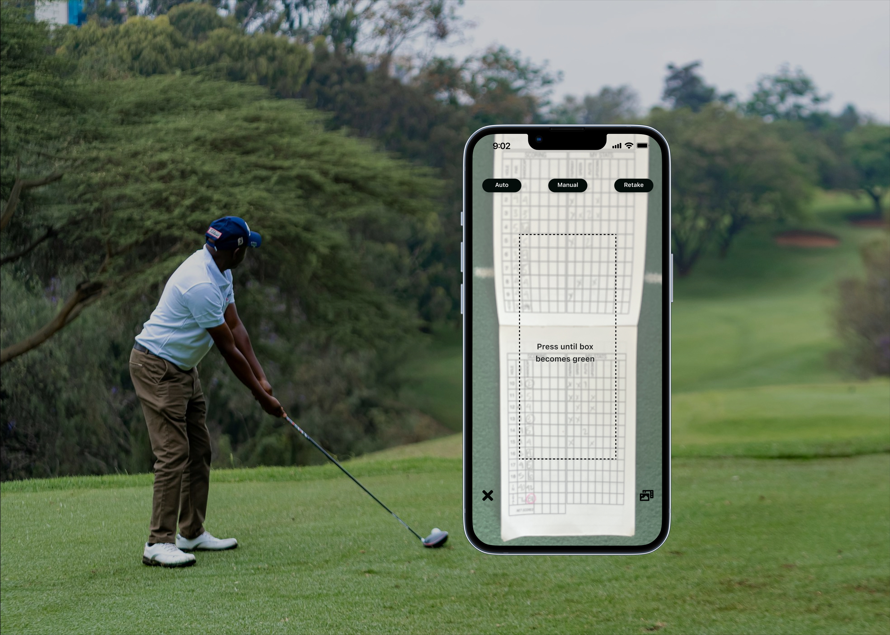
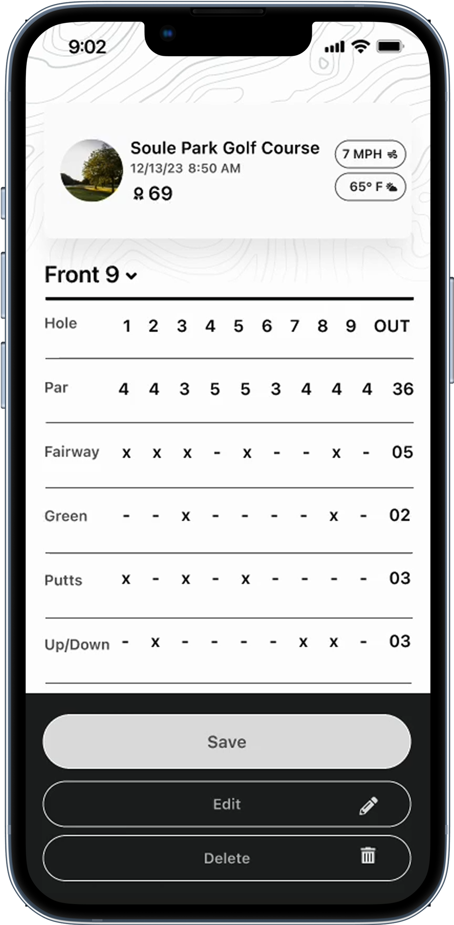
The Left Rough removes the distraction of your phone on the course by providing a mobile app with one primary action: the ability to take a photo of your physical scorecard, then upload it into your personal database, after the round.
Current Issues
Current apps on the market are full of bells and whistles. While many of these offer several positive training options, many users are looking for just a simple archive mechanism.
Current Pain Points in competitor apps:
- Poor User Experience. Cluttered navigation.
- Too many features
- Lack of clear CTA's

Research From The Local Golf Community
I also surveyed recreational golfers, ages 24-70, from 5 different Los Angeles Municipal golf courses to gain information about their experience.
Prefer to golf with their phone.
Prefer to golf without their phone.
Feel phone is distracting on course.
Competitor Reveiws and Chatter
Exploring other competitive golf apps on the market and analyzing user reviews, certain patterns and concerns could be identified.
"I spend more time getting the round ready than playing it."
"The focus is features I don't need. I'm just looking for something simple to archive my scores"
"I find the app busy and confusing to navigate"

Who are the players?
To better understand the users and what they need, patterns were extracted from the research and personas were created to bring them to life.
Pain Points
Busy interface and confusing to navigate
Noisy and unclear CTA's
Distracted focus causes negative play
Large set up time and long tasks

Carly Brunswick
Occupation: Sales manager
Age: 36
Location: Colorado Springs, CO


Stevie Wilson
Occupation: Real Estate Executive
Age: 62
Location: Beverly Hills, CA
Ellen Cho
Occupation: Retired Accountant
Age: 54
Location: Pasadena, CA

Wyatt Baker
Occupation: Software Engineer
Age: 41
Location: Madison, Wisconsin


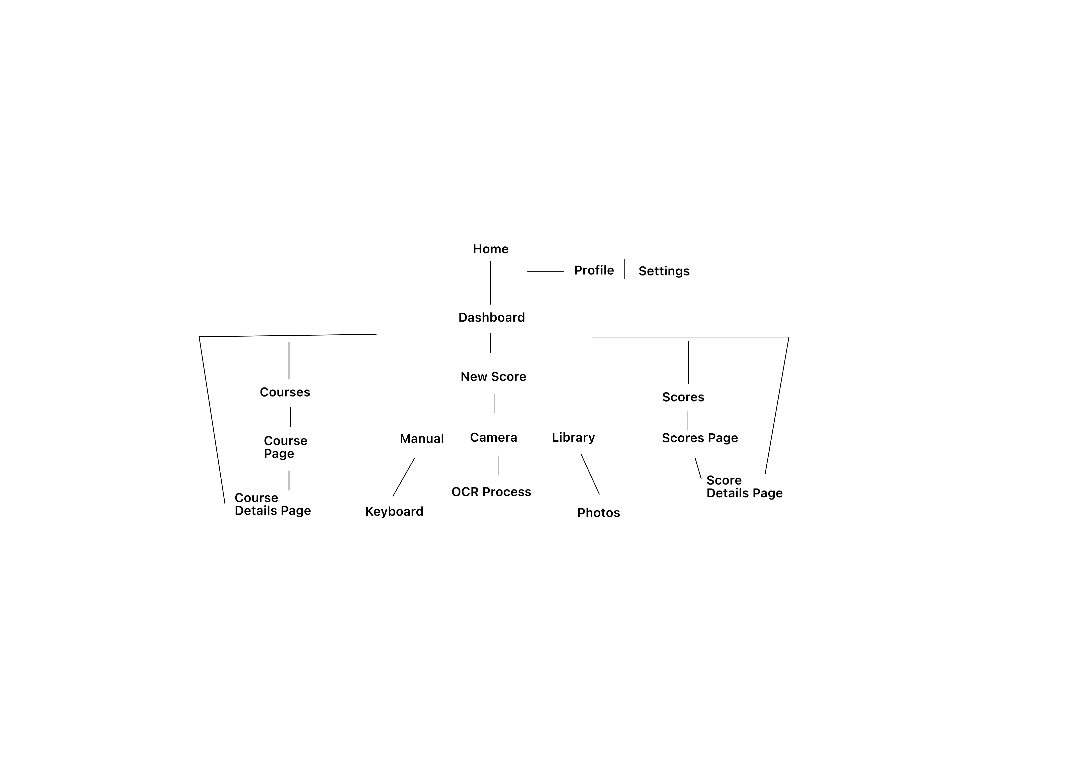
Architecture
From here, the research started to define the content and structure. I made a choice to use an icon library and keep navigation simple, then put together a preliminary user flow and built wireframes to reflect this.


Crafting The Brand and Visual Language
Classic, Minimal, Cheeky.
The logo is composed of a classic font with basic shapes and some border radius. This creates a timeless, playful vibe and echoes something familiar yet fresh, while also nodding to the rough. It is designed to be very minimal, accessible, and work well across mobile and digital collateral. Imagery is fresh, classic, and golf-centered. The tone of voice is cheeky and light.
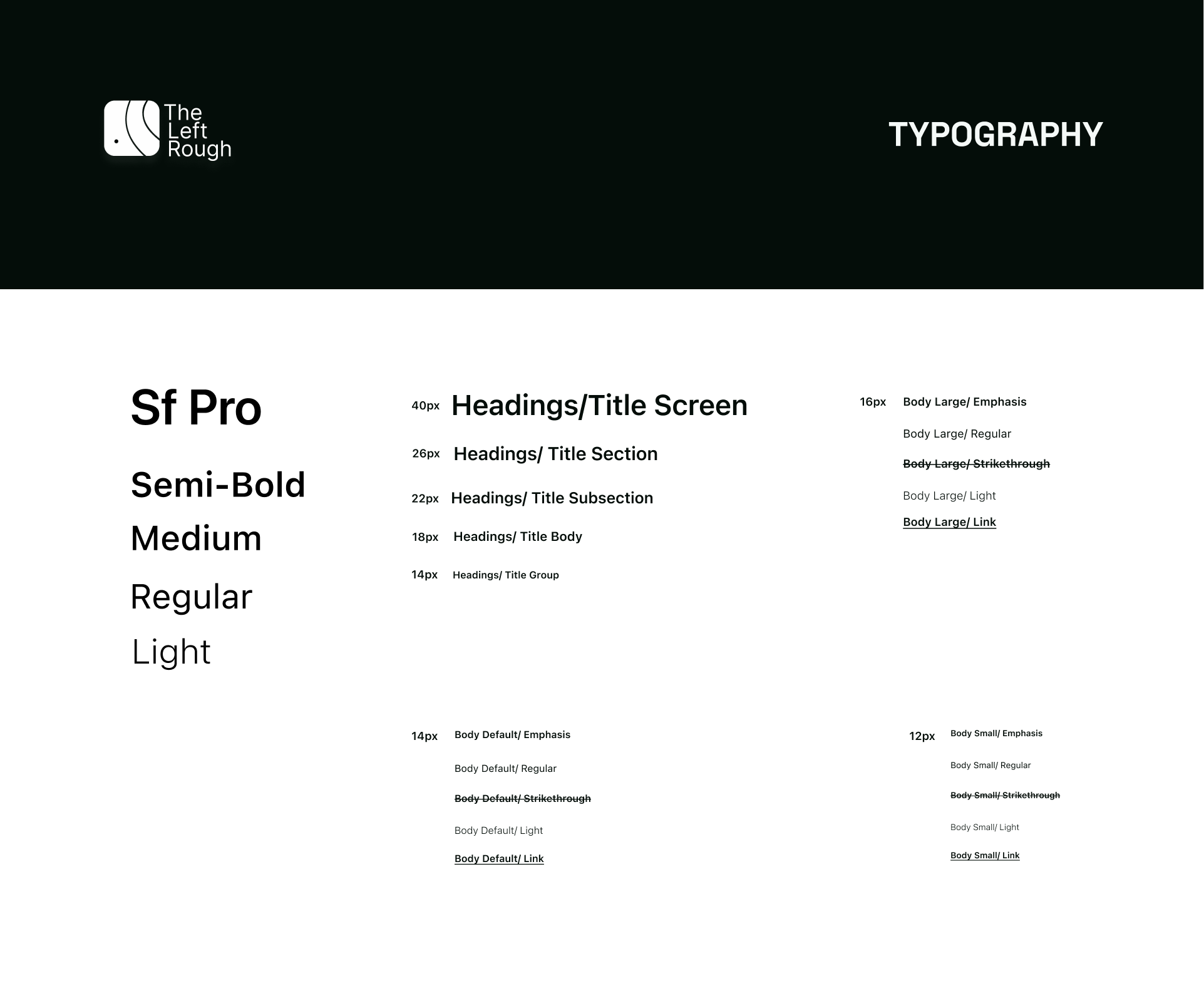
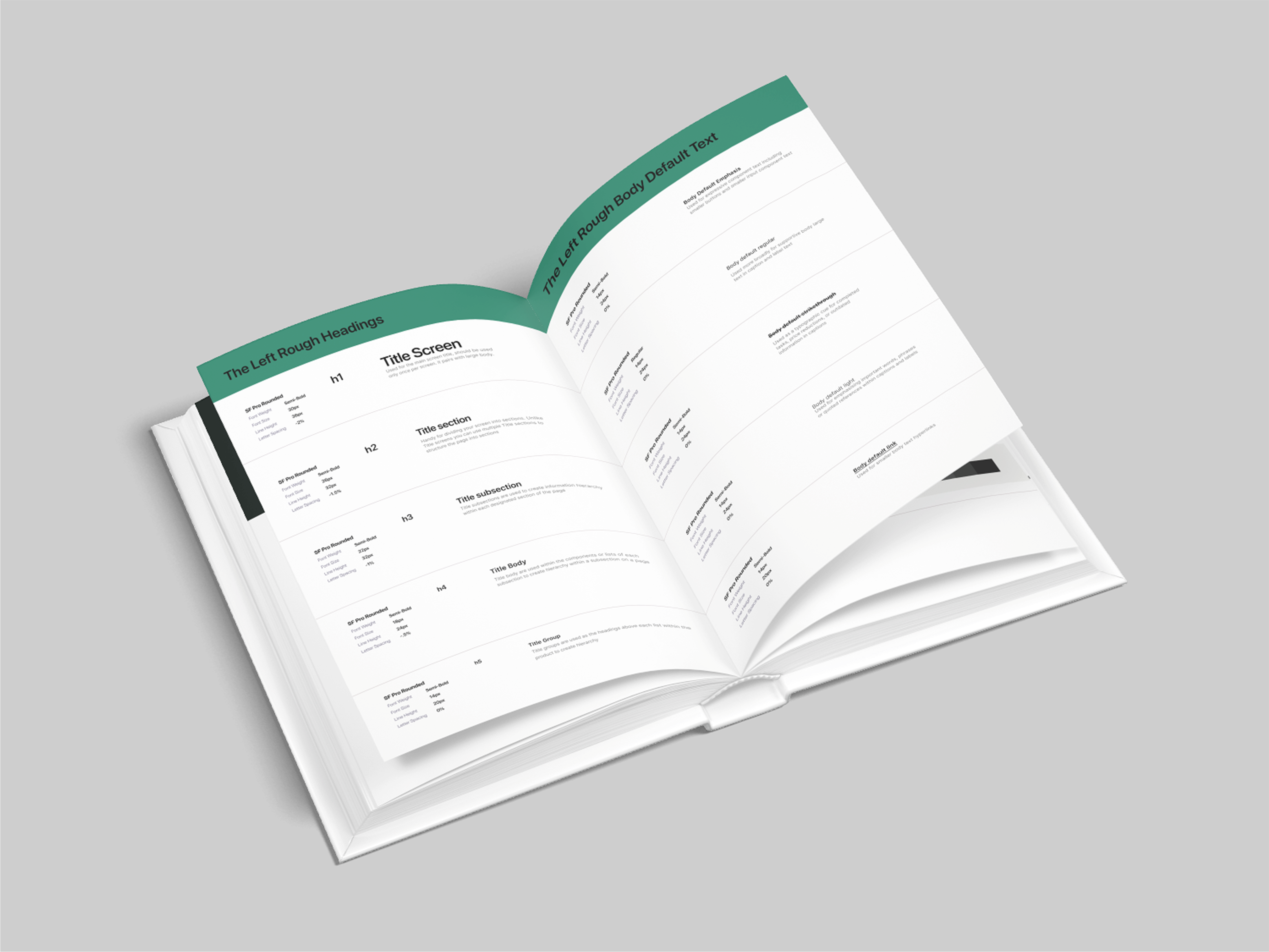
Typography
Typography is simple and classic, keeping the app accessible and with a clear hierarchy. The font choice is the default system font for the Apple ecosystem and is used frequently in IOS products.
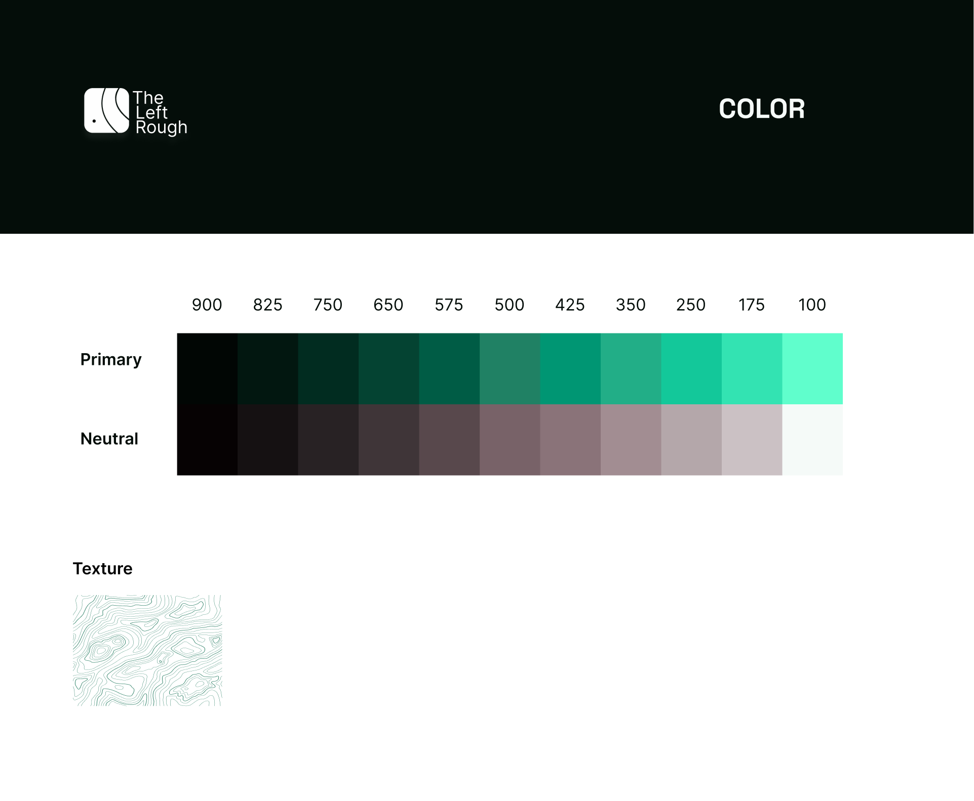
Color
The shades of green are inspired by the different layers of golf course grass, all the way out to the rough. The scale has been curated to work across light and dark modes and has been adjusted for accessible contrast.
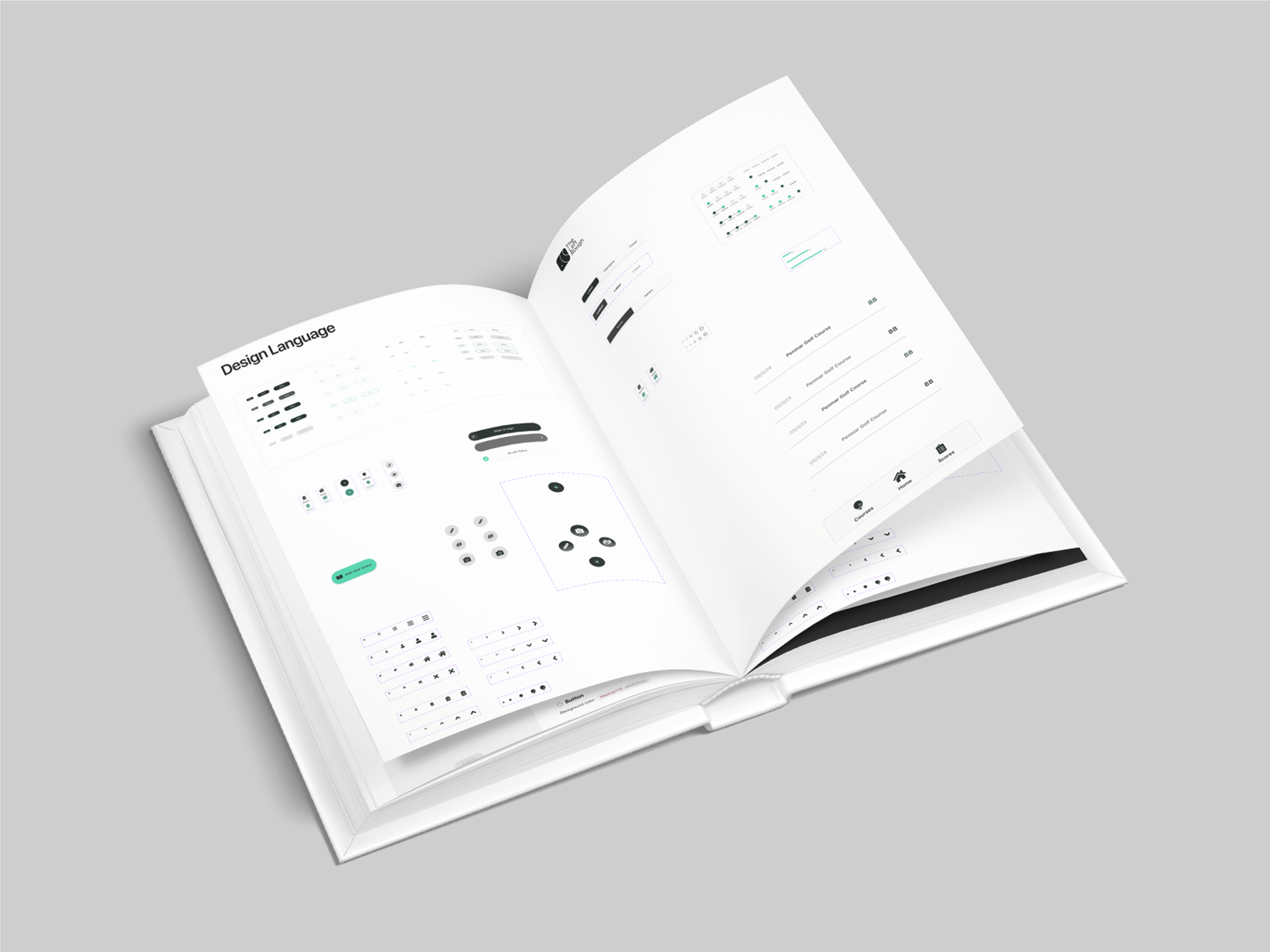
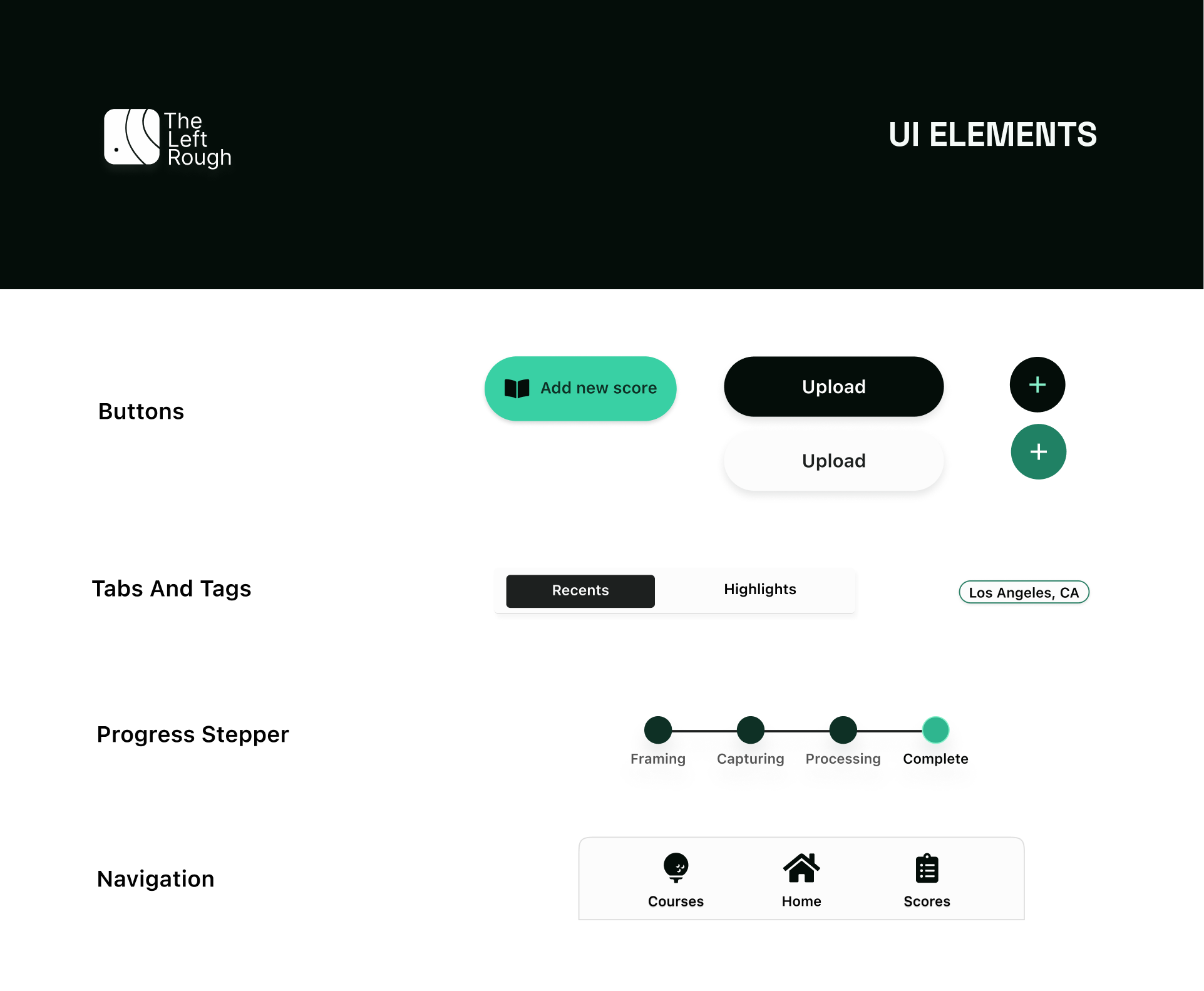
UI Elements
The concept of Familiarity drives the design language and style of UI elements. Everything is designed to keep cognitive load low, reduce the learning curve, and CTA's clear. Keeping elements and patterns familiar builds trust and leads to higher engagement.
K.I.S.S And Tell
Taking the user patterns into consideration, the flow itself requires a very low commitment of learning and was intentionally designed to be easy to use.
The UI is clean and minimal with familiar patterns to keep the user focused on the main goal; uploading scorecard.

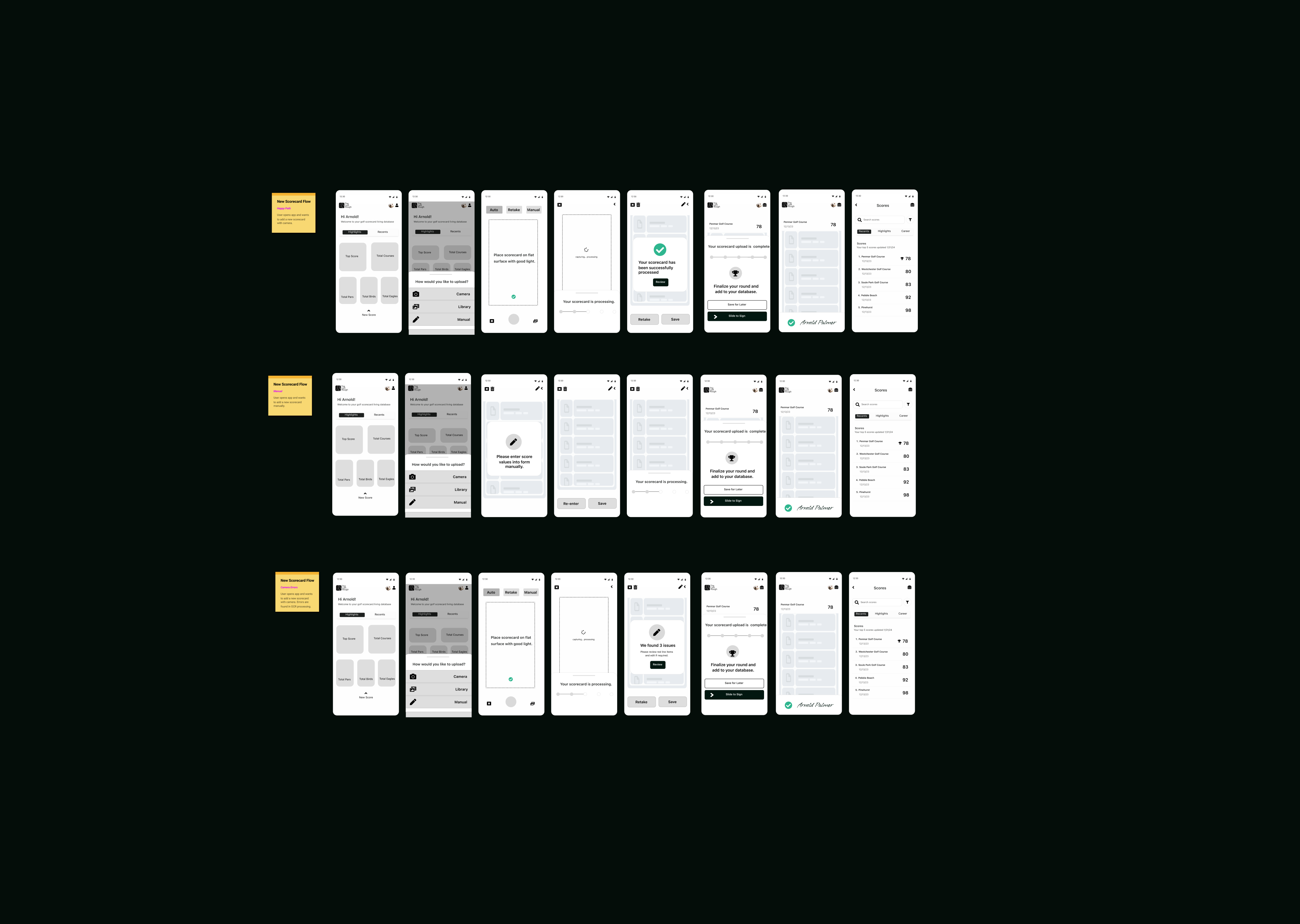
The Flow:
Upload New Scorecard | Happy Path
Confirmation Treats
We all like a ‘high five’ when we do something good. The Left Rough keeps it simple but offers confirmation animations to keep the user engaged and delighted.
Slide to Sign button, mimicking real world gestures for texture

Reflections
This was a personal project in a vacuum, so the results were neat and tidy, unlike the real world.
While this gave me great practice in bringing a concept to life digitally, as well as the opportunity to think through the structure, visual system, and the interactions that would best suit the users, I was able to avoid many real-world variables. While it was all valuable, I understand the unrealistic nature.
The personal wins and takeaways for me were:
- Translating a brand into a design language and UI
- Design thinking through the objective and delivering a mid/hi-fi prototype within in a deadline
- Sticking to the prime directive: One primary action
- Building an identity with room to grow
- I believe with feedback and testing we could iterate into success
Thoughts to Improve
While this is still rough - pun intended - I believe this starting point would initiate a basis for testing, allowing us to respond to the user and adjust accordingly.
Things I would have done differently and with more time
I did get some unfiltered feedback. Golfers in my personal network played around with it, and my dad. But, to get the gestures right and really spend time with the edge cases for errors, especially with the scorecard upload, you need to break it and have people play with it. So, more breaking and poking holes, and listening to feedback.
| UPDATE |
My process (and the tools available) have shifted quite drastically since I finished this project. If I were to approach it again with where I am now, I think I could have gotten the rough prototype out way faster. Then I would have tried A/B tests of the upload flow and iterate accordinly.
Thank You!
If you'd made it this far, thanks for scrolling by. HMU, let's build something cool!